

Redesign a news app experience for an Indian millennial news consumer in a seamless, appealing yet functional manner where they can also verify fake news.


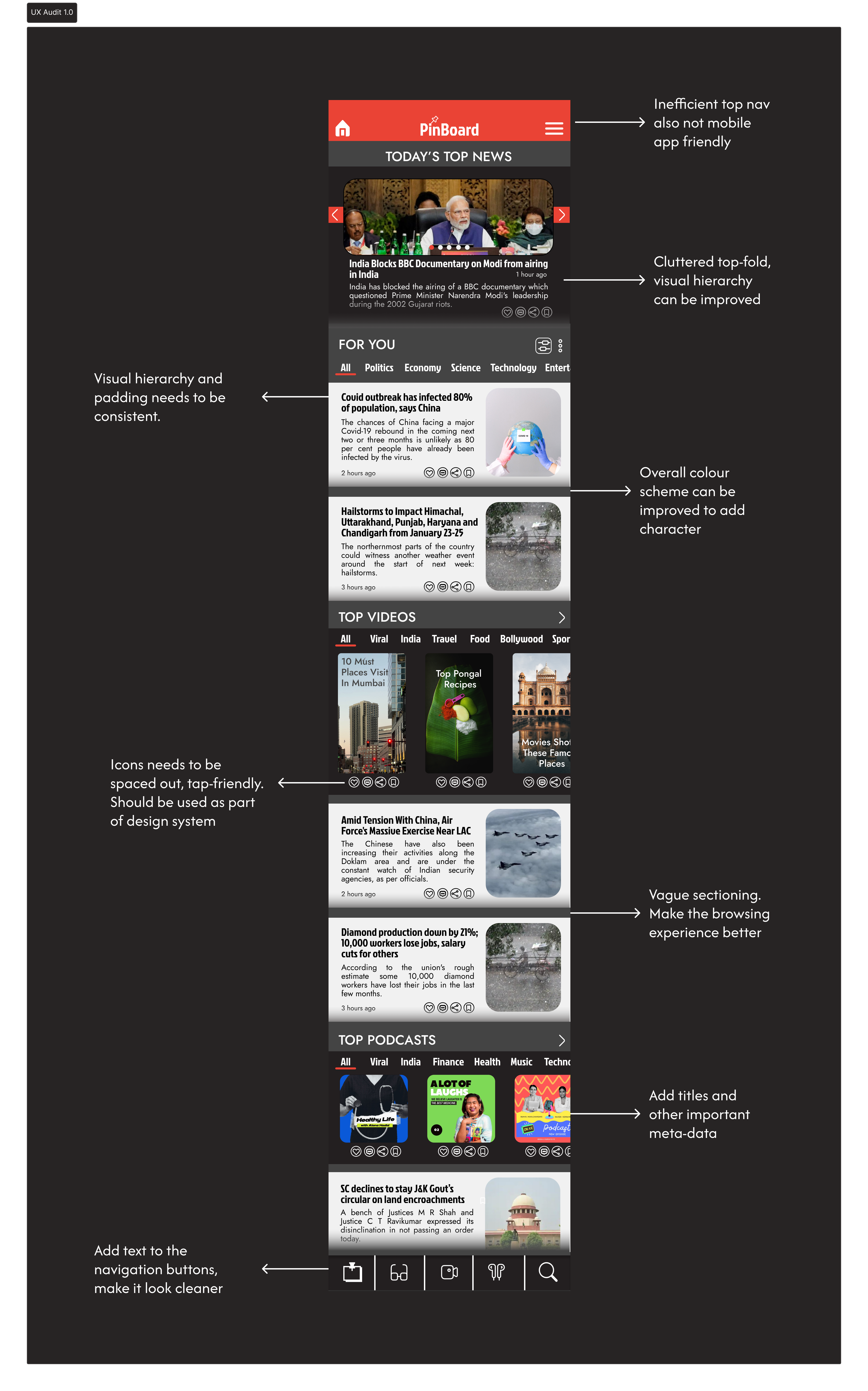
It was important to understand where the last design iteration stood, what were the shortcomings and how can it be improved.
At first glance, I felt there was a huge scope of improvement and while I cringed at what I had created myself, there was a sense of confidence that I have the skills, experience and knowledge to actually improve it!

The experience felt boring, with no points of delight in the user journey.

The visual design felt clunky, cluttered, traditional and didn't stand out much.
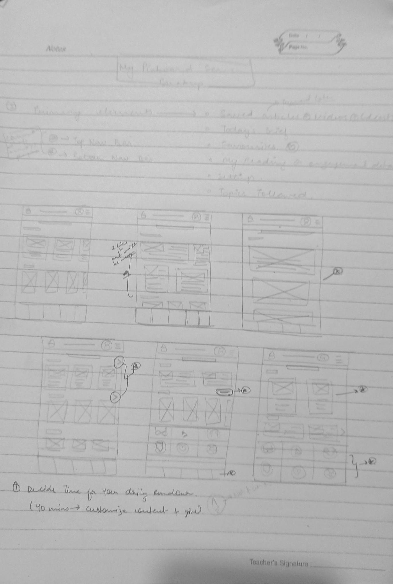
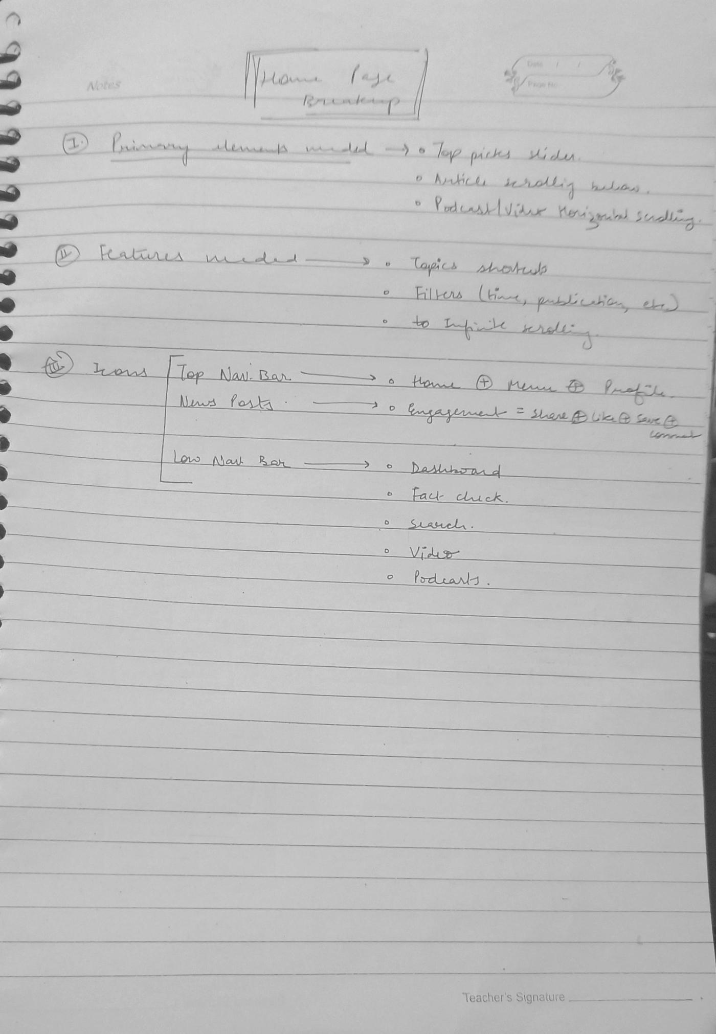
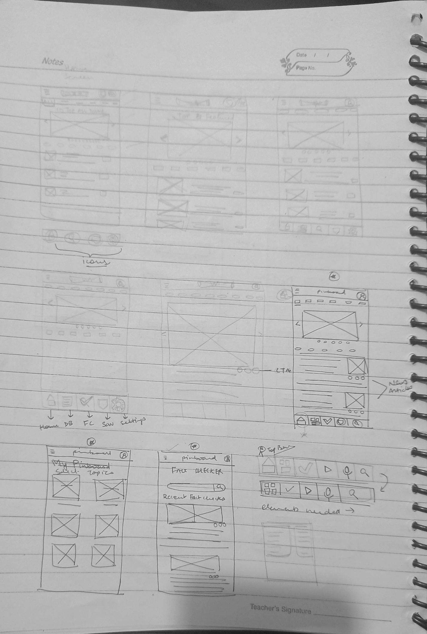
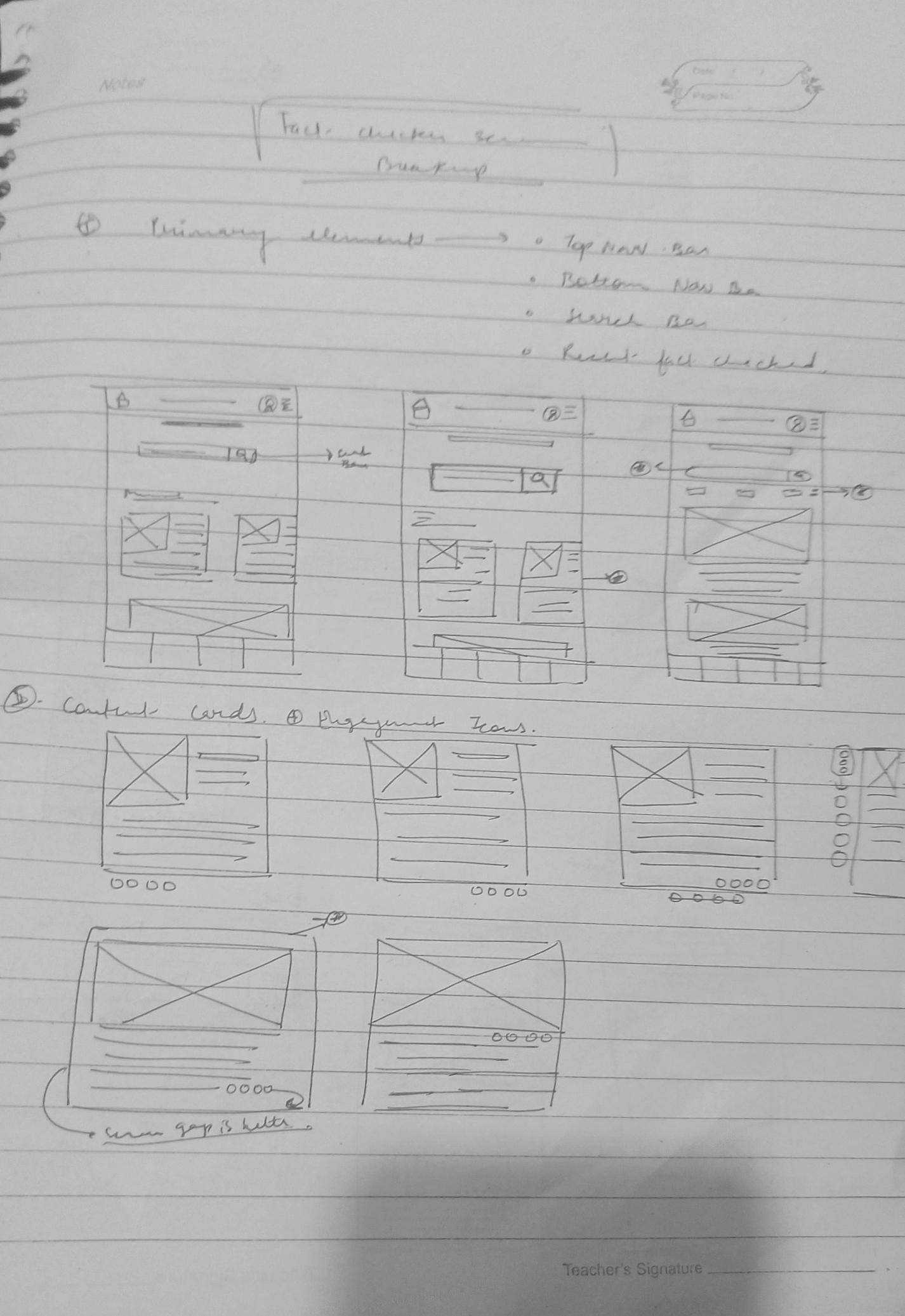
Intuitive . Seamless . Delightful . Evolved
From prototype transitions, user- friendly navigation to accessing news-at-glance, the user journey was improved to be made seamless.
A design system with required components, icons and overall style guide made the process of redesign more efficient and impactful.
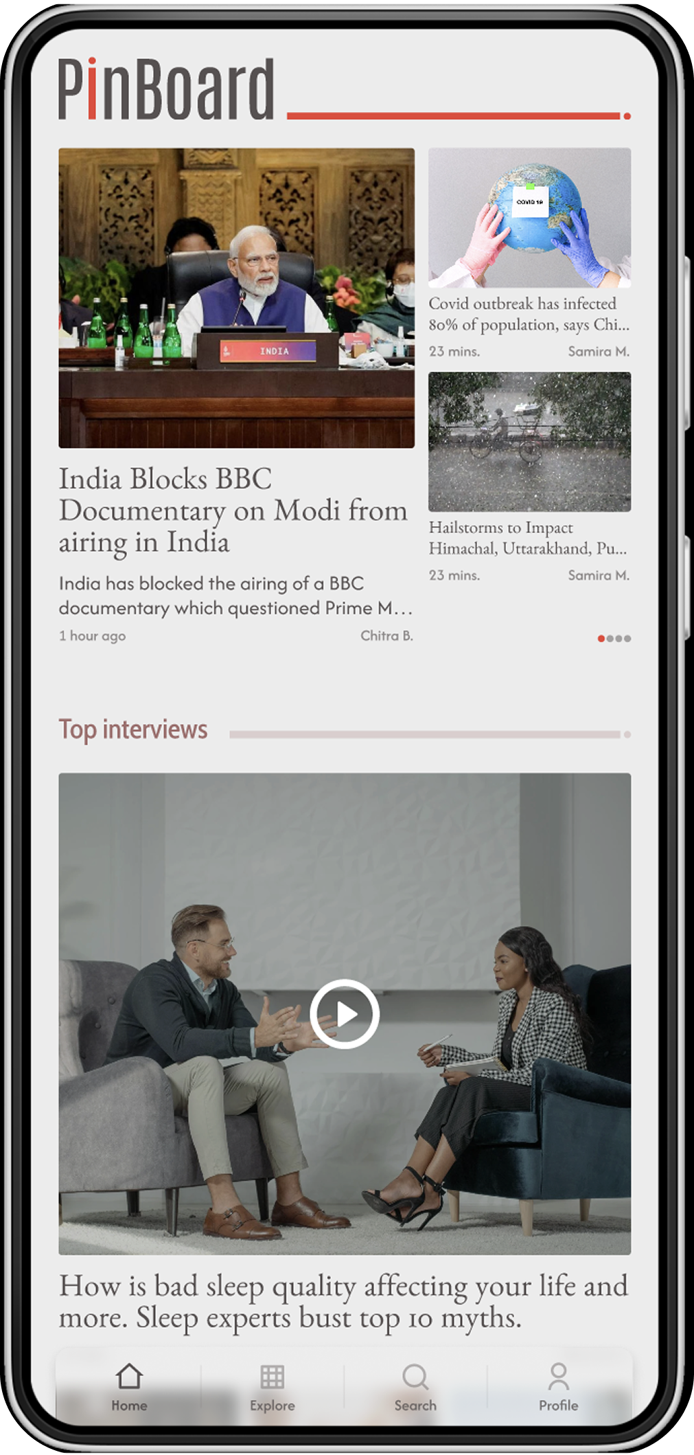
Revamped interface with better visual hierarchy, padding and spacing between elements to ensure it's mobile friendly and visually appealing.
The accessibility experience was improved while also including colours that make the product stand out and add touch of personality.
• It was overwhelming to see how much my work, process and skills had improved overtime.
• The exercise gave me the opportunity to reflect on my journey as a designer and the push to continue learning and evolving
• Due to paucity of time, it was challenging to prioritize ideas and functionality and so I had to narrow down the scope and focus on improving the most important aspects of the product.